Aesthetics are a consideration in every video game ever made, because every video game constitutes a work of (at minimum) visual art. Of particular importance to the medium is the *consistency* of the aesthetic approach of a game’s art. This consistency can be expressed at the high level by concepts like artistic “style,” narrative/mechanical “theme,” or even more nebulous concepts such as the “atmosphere,” or the “personality” of a game. There are numerous granular conventions that lead to the hyper-tight aesthetic expectations of modern games. Nevertheless, stylistic choices such as color-coding, action-highlighting, depth-of-field shaders, and so on are critical to making a modern work of gaming art.
Affordance is the mechanical counterpart of aesthetics. Affordance is the creator’s use of game art to tell the user how to interact with the game in the intended manner. It is art telling you how best to enjoy art. Tutorials, expositional modal elements, and such are not typically described as affordances. Affordances are woven into the game itself, gently pushing our mammalian brains to push the right button at the right time.
Since shmups have such a long and rich history,<link to History of Shmups article> there are countless ways in which they have combined aesthetics and affordance. Using visual effects, sound effects, and haptic feedback, a well-made shmup will help you learn to play it as you go. Such a shmup will also present opportunities for deeper learning on subsequent playthroughs. Ideally it will take multiple approaches to teach a single concept, since we all learn in different ways, from different sorts of cues.
Part I: Enemy Bullets
Let us begin our journey by considering a relatively narrow topic: the art and design of enemy bullet sprites. Let us examine an early (but wildly successful) series of games, arguably king of all shmupdom: Gradius. Behold these little 4-panel diamond bullets in Gradius 3:
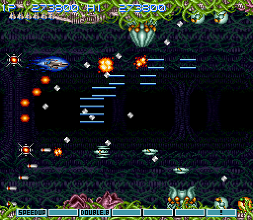
These “targeted diamonds,” are typically shot from an enemy directly toward the player at low speeds, forcing frequent movement when they are present. They have a simple two-frame animation that switches out the brighter and dimmer faces. Because of its high-contrast, simple design, and the p[alette switching animation which augments that contrast even further, this bullet is very “readable” for the user. However, (as is often the case with such single-minded affordances) it is quite ugly. Another bullet-trope in the Gradius series is the kind fired by the distinctive “Moai” heads:
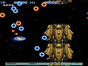
These ring-shaped sprites are much larger, move in relatively undirected volleys, and have a more colorful, eye-pleasing appearance than the targeted diamonds. These larger “flashing ring” bullets have a bright, flashy, two frame orange/blue animation. These colors are at opposite sides of the color wheel in order to provide maximum contrast against any background. A simple solution, and arguably the dominant one even 30 years later. Look at this reminiscent pattern from Jamestown:
These alternating streams of pink and blue bullets are very crisp and bright against the yellow, brown, and grey visual background elements. Different levels and bosses have differing color palettes to best match the background images, but the core approach is cohesive, readable, and aesthetically consistent. They don’t have much in the way of animation, but between the bright colors and the glow effect, they really get the job done. Let’s call bullets like these “bright blobs.” Here they are in a different Jamestown context:
As you can see, enemy bullets need not all be the same color, or even have the same visual layout. Nevertheless, all these bullets have a (more or less) coherent aesthetic, they appear bright and recognizable against the background imagery, and they communicate important details about their characteristics to the player. Different looking bullets can imply different speeds, tracking characteristics, or surprise variability (such as bullet “bombs” that spawn additional bullets after being fired.) Now that we have established some foundational elements of enemy bullets, let us turn our focus to a related subject…
Part II: Active/Background Differentiation
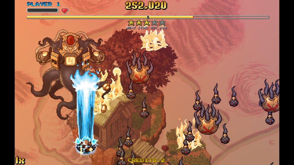
Consider the aesthetic imperatives that allow for differentiation between the immersive and beautiful elements of a background, and the functional elements of the active playfield. In the early days, there was no background imagery to speak of, save a few dust motes or distant stars. Telling the difference between gameplay elements like enemies, bullets, asteroids etc was a trivial problem. Until there came an innovative game called Xevious<link>. Xevious saproclaimedid “Let there be a rich, colorful background with interactive elements both in the sky and on the scrolling background surface!” And lo it was…pretty good. And the people rejoiced.
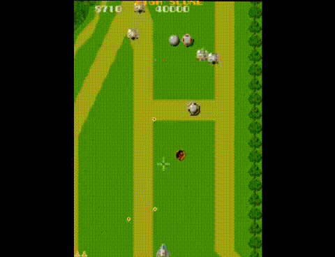
Xevious’ solution to the problem of active vs background differentiation was simple but very effective. Nearly all of the enemies in the game are the same dull metallic grey, and the backgrounds rarely have any monochrome elements. Simple, effective, and as ugly as dried mustard. Let’s see how a modern shmup tackles this problem.
Here you see the magnificent shoot-em-up Super Hydorah <pronunciation link> doing one of the many things it does well. Note that the interactive layer and the background layer contain the same elements. In addition to the smaller scale of the BG elements required by the near-ubiquitous perspective camera projection of even “retro” style games such as this, Hydorah takes another step to apply a uniform darkening of the elements. In order to make this approach work, they also must use dark background (static) images in the distance, so that the BG ships visually “settle” against the even-darker deep background. This approach is a very solid one, but it implies that the background can’t do much “storytelling” on its own. You can add context and depth of field with background elements that mostly duplicate the interactive elements, but since your deep background must be so muted, there is little opportunity to use it as part of the storytelling medium.
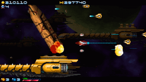
Although a little older now, Sine Mora remains one of the most beautiful, and most story-driven shmups of all time. Sine Mora had the additional challenge/opportunity granted by being fully 3D rendered. It took several different approaches to active/background affordances, but the most clever was to apply an intermittent shader effect to all of the interactive elements. Enemy ships can enter from the background without much confusion for the player, because as soon as they become vulnerable/dangerous, they begin to regularly show a “diagonal stripe pulse” effect as seen here with the oval-shaped attacker near the center of the gif.
Sine Mora also used this effect on game elements which were physically attached to non-interactive elements–most typically in the form of gun-turrets on a big boss. Here you can see the effect washing over the square turrets on this boss enemy
This effect rolls over every “touchable” element on bosses, once every second or two, and once your brain keys to it you always know exactly where to shoot. Though technically complex, this affordance lies at a “sweet spot” of subtlety and effectiveness
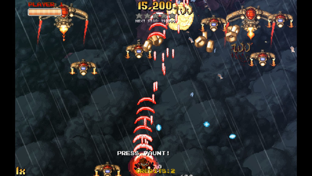
Another approach to the active vs background problem can be seen in our old friend Jamestown.
Here, we see a background that is bright, rich with interesting detail, and yet very clearly distinct from the active enemies. The background has two parallax layers, the deeper is extremely muted, but nevertheless provides negative space with a pleasant aesthetic. The shallower background layer is where the richness is…and Jamestown excels at using this medium to add to its memorable and atmospheric narrative. The secret sauce that makes it work is the thin but crsp black outline surrounding all of the active elements. This subtle aesthetic allows the user to play the game effectively, while also playing a little “movie” behind the action.
There is a significant limitation to this high-detail approach. it requires bright backgrounds so that the outline affordances are always nice and crisp. But what do you do when you need a darker background to portray specific environments, such as deep space or night-time? When it needs to, Jamestown circumvents this requirement by removing the storytelling detail in levels with dark backgrounds. The foreground elements in these levels must be nice and bright, like this:
On these darker levels, the bright enemy sprites have sufficiently contrast against the repetitive, muted background, and thus do not require the outlines–which are completely invisible against this dark, low detail background.
Part III : The Complete Aesthetic
In most any game, the look of enemy bullets<link to part 1> and background/active differentiation<link to part 2> are just two of several different factors that go into the overall aesthetic of the game. Because they are so critical in a foundationally simple genre like shmups, they define much of the topology of the game’s visual design. But there are countless, mostly unrelated, decisions that go into the overall aesthetic of the game. Let us briefly touch on some of the possibilities:
HUD design : how does the HUD “speak to” the game action, and vice versa? Are there gameplay elements that are too complex for simple affordance, which need some sort of specific UI callout? How do those elements mesh with bullets, backgrounds, and so on? How should the HUD reflect the overall aesthetic?
Menu design : Exceptional games have clean, understandable menus, with artistic and design elements that conform to both the core game and any metagames, as appropriate. Menus should “belong” in the world created by the gameplay and narrative.
Player Weapon design: in Part I we only discussed enemy bullets, but obviously the bullets that the player shoots from their avatar (and options, etc) are important as well. It is important to note, however, that the design of player bullets needn’t be quite as strict and uniform as enemy bullets must be. They matter, and any sort of affordance that relates to the characteristics of the “bullet” depicted is helpful, but since they are only your offensive focus they are of secondary importance–behind your ability to dodge enemy bullets etc.
Narrative: this might be considered a critical exception to the considerations of art aesthetic, but I include it here for completeness. Sometimes, the narrative theme of a shmup (or any other genre) might be completely divorced from the aesthetic presentation. Again, reference Sine Mora, a story about anthropomorphized animals living through a nightmare of racial subjugation, loss, regret, and general time-traveling horror. Bright, beautiful diesel-punk graphics belie some serious Animal Farm type shit!
Bullet behavior: beyond considerations of raw visibility, the best bullets also say something about how they work. Projectiles might look different (but still artistically coherent) if they are targeted, danmaku-style, or homing.
These are but a few of the considerations that may, or may not, play a role in defining the overall aesthetic of a shoot em up. There are several more that may contribute, as well. Soon, our work-in-progress “cinematic” shmup (code name DARKFLOW) will choose a final aesthetic…until next time shmuppers….Omicron out.